风雨不动稳如狗
固定在可视窗口最底部,页面滚动也仍然固定在最底部。
能屈能伸
页面内容高度不确定,希望 Footer 放置在页面内容的最下方。
我是一个 demo
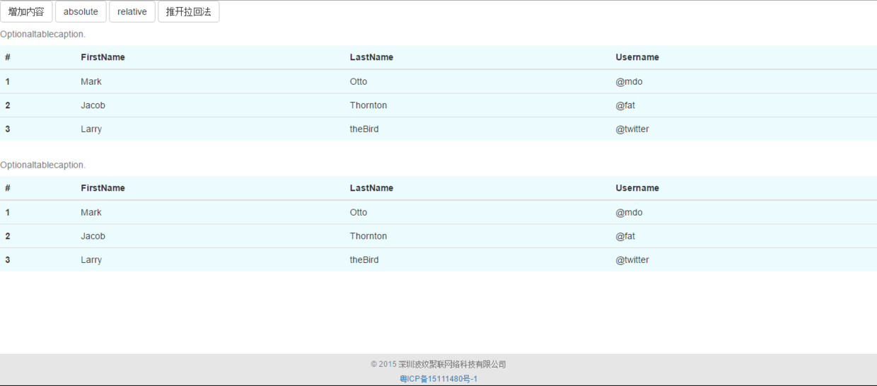
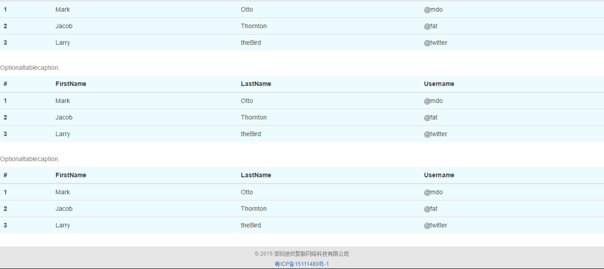
页面内容少,无法撑开,在可视窗口最底部
页面内容少
页面内容多,在页面最底部
页面内容多
怎么做
你想要风雨不动稳如狗,使用下列代码:
1
2
| positon: fixed;
bottom: 0;
|
对于第二种能屈能伸的情况,你可以
1. 设置 min-height
1
2
3
4
5
| <div class="main"></div>
<footer class="footer">
<p>© Scarqin</p>
<a href="http://www.miitbeian.gov.cn/">粤ICP备15111480号-1</a>
</footer>
|
1
2
3
4
5
6
7
8
9
10
11
| html,
body {
height: 100%;
}
.main {
min-height: calc(100% - 58px);
}
.footer {
height: 58px;
}
|
2. .main[padding-bottom] 写法
1
2
3
4
5
6
7
| <div class="wrapper">
<div class="main" id="main"></div>
</div>
<footer class="footer">
<p>© Scarqin</p>
<a href="http://www.miitbeian.gov.cn/">粤ICP备15111480号-1</a>
</footer>
|
1
2
3
4
5
6
7
8
9
10
11
12
13
14
|
html,
body {
height: 100%;
}
.main {
min-height: 100%;
margin: 0 auto -58px;
}
.main {
padding-bottom: 58px;
}
|
3.wrapper:after 写法
1
2
3
4
5
6
7
| <div class="wrapper">
<div class="main" id="main"></div>
</div>
<footer class="footer">
<p>© Scarqin</p>
<a href="http://www.miitbeian.gov.cn/">粤ICP备15111480号-1</a>
</footer>
|
1
2
3
4
5
6
7
8
9
10
11
12
13
14
15
16
17
|
html,
body {
height: 100%;
}
.wrapper {
min-height: 100%;
margin-bottom: -58px;
}
.wrapper:after {
content: "";
display: block;
}
.footer,
.wrapper:after {
height: 58px;
}
|
4. flex 布局
1
2
3
4
5
| <div class="main" id="main"></div>
<footer class="footer">
<p>© Scarqin</p>
<a href="http://www.miitbeian.gov.cn/">粤ICP备15111480号-1</a>
</footer>
|
1
2
3
4
5
6
7
8
9
10
|
body {
display: flex;
min-height: 100vh;
flex-direction: column;
}
.main {
flex: 1;
}
|
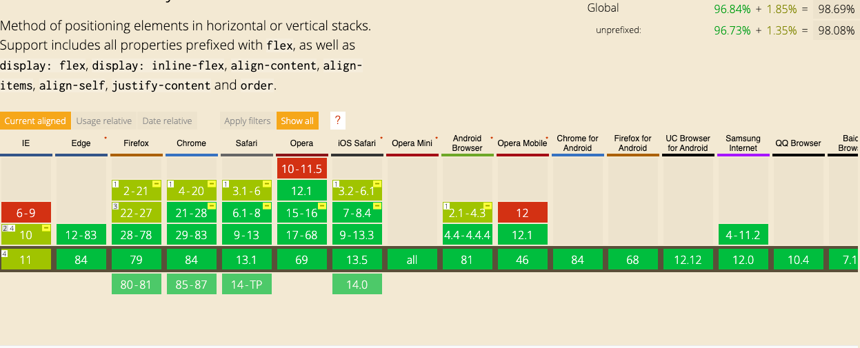
注意:vh 兼容性表,兼容性还不错,只是安卓 4.3 以下都不兼容。
红色为不兼容 黄色为部分兼容 绿色为兼容
5. Grid 布局
1
2
3
4
5
6
7
8
| <body class="body-grid">
<div class="menu"></div>
<div class="main" id="main"></div>
<footer class="footer">
  <p>© Scarqin</p>
  <a href="http://www.miitbeian.gov.cn/">粤ICP备15111480号-1</a>
</footer>
</body>
|
1
2
3
4
5
6
| .body-grid {
display: grid;
height: 100vh;
grid-template-rows: auto 1fr auto;
}
|
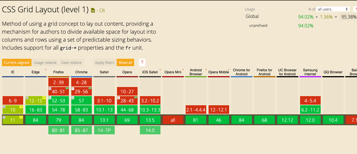
兼容性不如 flex 布局,预计 95% 的用户能在遇到它时保证页面布局不出错。
综上,如果内容多的话,不去捣鼓 footer 也行,当内容不确定的时候,上面方法可以一直保持在页面内容的最底部。
参考资料
最后更新时间: